In any communication, there is a risk of misinterpretation of the message between sender and receiver.
When we plan our communications, we intend to send message “X.” A recipient receives and translates our message with his or her own lens, history and perspective. The result may be that “Y” is what’s heard.
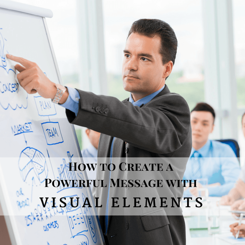
There is a reason for the expression “an image is worth 1,000 words.” If we want our message sent and received as we intend, images can make all the difference.
We’ve all seen them – those powerpoint presentations or infographics that make a message stick. Images that lessen the need to interpret what is being said, and create a mental image consistent with the sender’s intent.
For better or worse, leaders spend a lot of their time communicating – both sending and receiving. If that communication is limited to words, there is a risk of misinterpretation on both directions. Yet, the use of visual elements can accelerate alignment.
We’ve all done it – seen amazing powerpoint presentations or other images that we think “wow…I couldn’t do that.” Of course you can. We all can.
Following these steps, we can increase the “stickiness” of our messages through imagery.
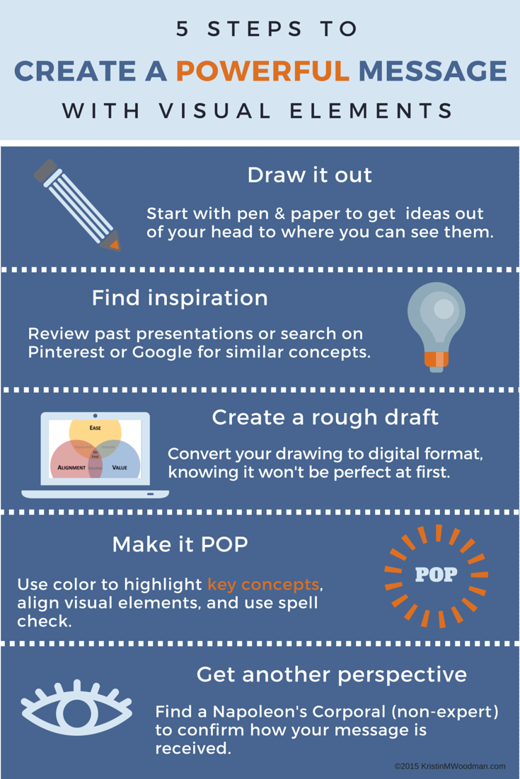 1. Draw it out
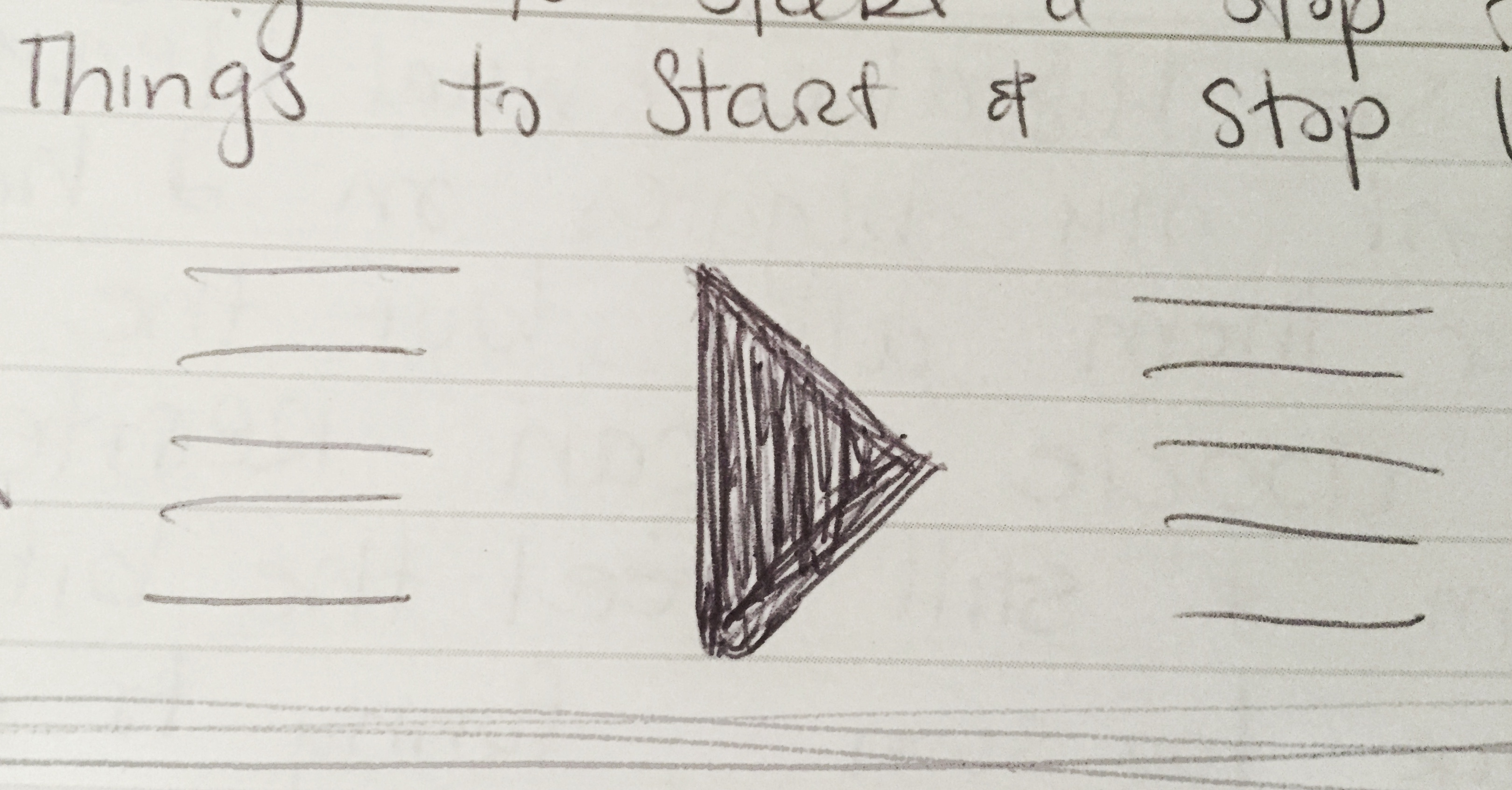
The first step to any image is to put pen to paper. Napkin, post-it notes, receipts – it doesn’t matter the surface. What matters is getting the first visual out of our heads and onto paper.
I’ve come to accept that every conversation or idea I have results in a picture, and always keep a notebook with me. While that can work anywhere, I have found other tools to work as well.
When sharing ideas over distance, I like the Boogieboard Sync, which a co-worker introduced me to. It allows me to draw in paper and pen fashion, while sharing it online. When I’m done, I can save it electronically.
Whiteboards are great for sharing ideas in person. They can be erased and changed, making it easier to evolve the image or try different concepts.
I’ve also found whiteboards valuable for planning out presentations or process flows. I use post-it notes with the key concepts and map them out, quickly rearranging them until I get things how I want.
Here is an example of a sketch I did for an old article. I wanted to add a checklist to reinforce the key messages after someone was done reading. It isn’t fancy, but was enough to get me started.
2. Find inspiration
Often, whatever I’m trying to communicate can be framed in a visual I’ve used or seen before. Alternatively, I can look for new inspiration.
I maintain a library of powerpoint presentations that have been used successfully in other meetings. If I sit through a discussion and like what the presenter used, I may ask for a copy, or make notes for myself to use later.
If I can’t find anything that fits, I search on Pinterest or Google Images for ideas. I search on my keywords and find infographics or other imagery to generate ideas on how to structure what I want to communicate.
Here is an example of a side-by-side comparison (#1) I found on Canva (more on that shortly). I modified the layout for the article revamp (#2). Since this article also had 5 key points, I was able to repurpose the layout (#3).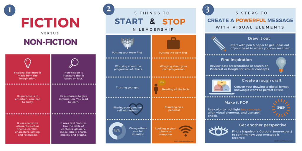
3. Create a digital rough draft
It’s time to convert the hand-drawn image into something that can be used digitally.
I use Powerpoint exclusively at work. It’s the tool of choice for conveying most of our messages because it presents well via teleconference. We find that our presentations often have feet, so packaging our messages assuming they will be shared is important.
Powerpoint is also easy to use for creating checklists and worksheets for my blog posts. I can make them visually appealing, aligned to my color scheme, and save them as a PDF for all of you.
Canva is my other blogging tool of choice. I use it to create article headers, infographics, and other visuals. Canva is designed for the non-designer to create visually appealing graphics, and is very easy to learn and use.
4. Make it POP
Our first pass at anything isn’t going to be perfect. That’s okay and expected. I will often try a few different designs before I find one that resonates.
I also have a checklist that I use for making sure my message is clear and there are no unwanted distractions. Here are a few things I look for:
- The eye naturally starts at the upper left; consider that space for a key message or visual element to highlight
- Use color to reinforce for key concepts
- Use consistent colors and fonts aligned to your business
- Ensure lines and elements align, with consistent element sizing and spacing
- Any words should be spelled correctly with appropriate grammar
5. Get feedback
With anything we work on, whether it’s an image or article, our brains relax and we start seeing what we expect to see. We have a few choices when editing, to make sure we didn’t miss anything or make a mistake.
The first is to put it away and come back to it. When our own eyes are fresh, we see things differently.
The second, which I always recommend, is to get input from others. This helps to identify gaps, as well as solicit input and ideas on how to ensure our intended message is coming through in the imagery.
To improve at anything in life requires “practice, practice, practice.” Visual storytelling is no different. By repeating these steps, we will become more proficient at creating images that help relay our intended messages and make them stick.
Do you have other ideas on creating imagery that makes a message more powerful? I’d love if you could share your ideas in the comments and keep the conversation going.